Game Design and Art directions

Did the searching of souls, and found none.
I did have all that research lying around and a broken C2 experience tho... So real quick: Don't throw that stuff away. Use it, and organize. No matter how smol a project, a good, solid outline will give it a good chance. A so-so outline will at least keep you focused.
Let's dive into an outline, think about the stuff that makes a GDD, and make this game.
Outline:
- [MECHANIC] - RPS, Traditional Ruleset
- Main - Mage ==> Metal ==> Meat =/=> Mage
- Option [Resolve Ties] Mage == Mage
- Power Meter
- Secondary RPS action
- Player control
- Delivery/interation
- Gamepad
- Touch control
- Keyboard
- [GAMEPLAY] -Competetive
- States of Play "First to win 3 Rounds is ruled the winner."
- Player wins round: +1pt
- Player loses round : Opponent/Obstacle +1pt
- Win State - Player gains 3pts
- Lose State: Opponent/Obstacle gains 3pts
- Never a Tie-Game state [3-3]
- Modes of Play
- 1P:
- STORY - Defeat scripted AI obstacles - e.g. Training puppet, Narrative - focused Bad guys [Butcher loves MEAT].
- Arcade - True RPS AI - 1/3 chance w/behavioral slant to lead in first round with ROCK.
- Survive Lives - Play until you lose all your lives. Win counter is kept
- 2P:
- Local 1v1 VS Play
- 1P:
- States of Play "First to win 3 Rounds is ruled the winner."
- [GAME LOOP]
- Loading > Title > 1P[Story, Train, Arcade] - Local 2P VS > Cahracter Select > Play Arena > W/L > Result > Continue, Play again >Title
- [Pause and mute/unmute buttons available during play -overlay the screen state.]
- Lose state offers retry or quit to title
- Arcade W/L results ALWAYS ask if you want another round.
- Survival only has L state and results. Always goes back to title.
- All sates can return to title from Pause
- Story Win Game state has narrative screens as reward. Finish story, always return to Title.
... ...
Now. Games love GDDs. Design Docs are great when treated as living Docs. An outline can serve in a pinch as your GDD. But it defines all major elements and art.
I need the practice, so EVEN THO this is just a tiny RPS, I will build a good little GDD for the project.
ART Direction:
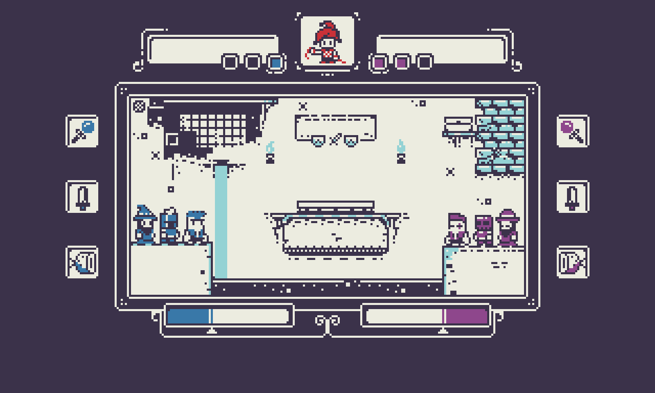
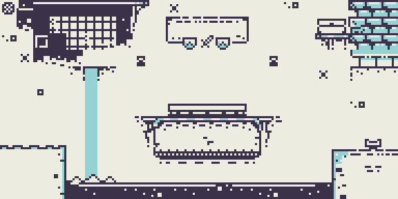
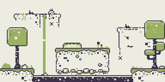
This hit me hard. I just CAN'T bring myself to do the art the way I was. So, I am currently exploring other options. Both the original look and feel and layout, and the tiny-pixel style I am sharing now. This will be a tedious task, but I got a decent start into a place I think it needs to go for me. I made decisions based on social input... and it kind of broke me. Basically, I was stoked to try a new style of art, and called for a vote, and we all locked me into something far removed from what I wanted. It. Killed. The. Buzz... It Killed. The. Game.
I need to apologize for that, if you were looking forward to it, also for not coming thru on the older version.
So, for now, let's just chew on these 8px square tile set level designs [BELOW], and the latest mock-up of the game [TOP]. Feel free to dissect these:


Welcome back.
MageMetalMeat
RPS with a little MEAT on it.
More posts
- On Brand, Off Brand.Apr 13, 2022
- The Long Game I'm PlayingOct 21, 2020
- ANNUAL(?!) Check-In: Back to WorkJul 04, 2019
- Another 100+ Days ago.Jun 11, 2018
- Back it up.Jan 30, 2018
- Dedication or Obligation?Oct 13, 2017
- Be my Art Director: UnitsSep 27, 2017
- The Secret Hands SocietySep 26, 2017
- Beginnings the Game.Sep 20, 2017
Comments
Log in with itch.io to leave a comment.
Just came across your content. Still working on it? I really dig the new art direction.
I am! I put all my personal work on hold while working at a web advertising firm. I'm coming back to all of my projects in June. Will update with a long(ish) post and show content progress!
Alright, looking forward to it!
I love the new tiny-pixel style and the minimal color palette!
Thanks! I am getting where I want to go with this piece, finally.