The Long Game I'm Playing
Man, I missed my yearly update!
So.. If you are one of the three people that follows this project, it is still alive, as am I, for now!
Let's gloss over just a little bit of where this is at:
ART:
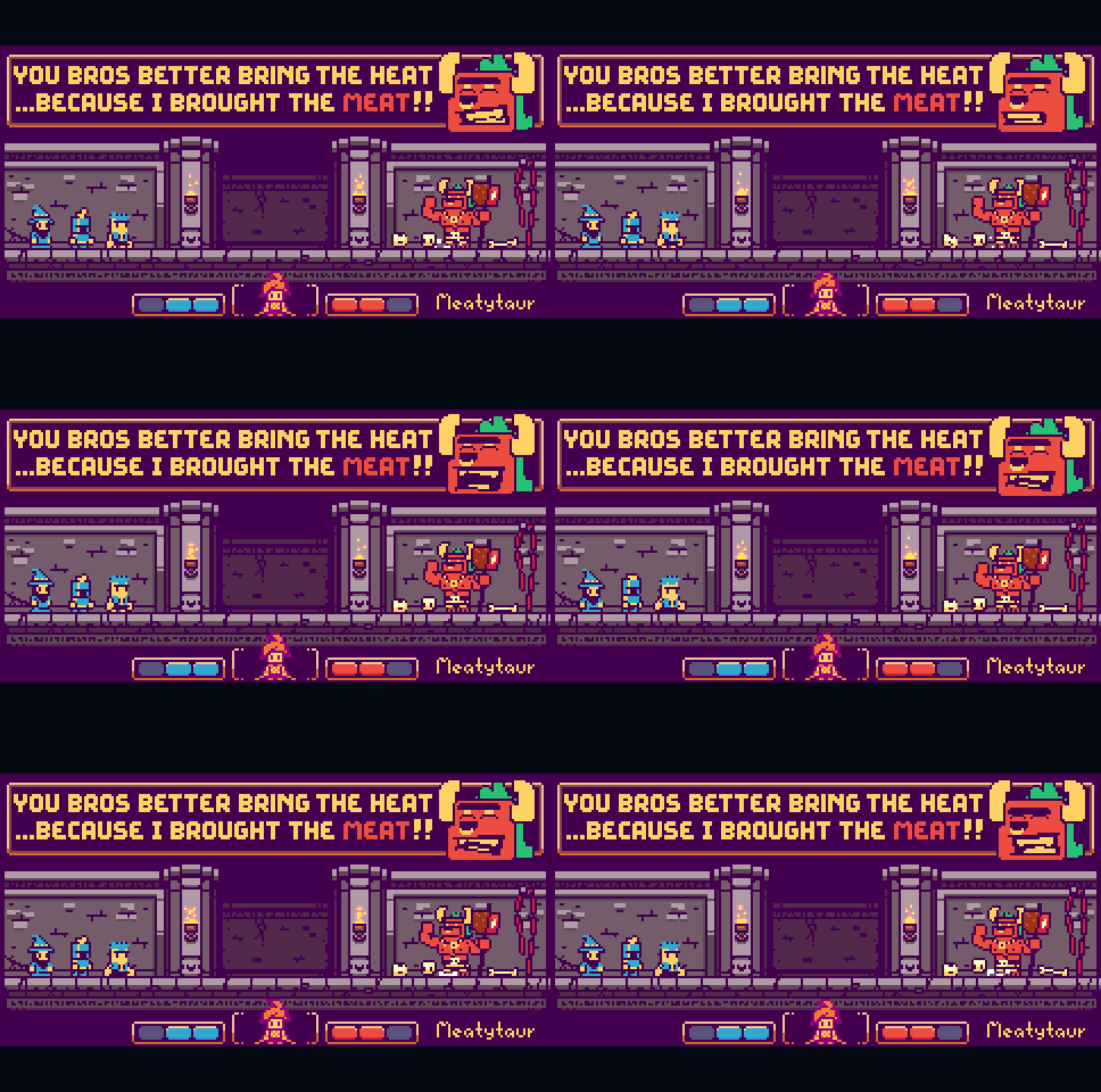
This is the look I settled on:

The guys are the right flavor for me. The NES-ish meeps come in at 3-colors and under 24px tall. The color palette will need a lot of work but the design is pretty much locked in.
This scene somehow combines the simple look I wanted with the dark look I almost took it all to... as well as the original flash game shape language I had before I decided to make it pixel art and open this project! So that is kind of cool.
The play will happen on a panoramic strip of different settings that bleed into the flat color BG where the UI lives. I can have a very good looking contained experience without the borders I was working with before, making it all feel a bit bigger and not so distant. The mockups here are too tight and don't leave room for anything else, so I will need to work out the dimensions of the play space and then lock in a look for the setstrips from there.
The goal will to expand from this look into whatever story experience I want to incorporate. If I use a dialogue system, an example of a talking head and the typography is floating up there too. If there is a story.. it has to have THIS GUY:

The Meatytaur. The sheer punnery of it all. This is what I live for. This image is also the best view into the spirit of what I want from all of this, what I want to present to a player. I want to be cheesy and playful. It's RPS! People have died for this game. DIED. Look it up. I can't say for sure, though. Probably, considering early gambling syndicates and such.
Note the UI change at the bottom. I the goal is still the same, to have a simple, tight RPS versus mode be front and center. So having a balanced VS healthbar/win ticker in-theme is a must!
Design:
No real changes or work in this right now. Versus is just what it is, RPS.
If I can get this train a-movin' though... I have a basic narrative structure and gameplay variations that make for an exciting time, in theory. My next updates will follow my follies in learning how to actually build the dang thing and find out if I can pull these ideas off. Until then I don't want to outline what can't be in it.
Projected Release date:
This is an exciting one. I couldn't POSSIBLY miss this deadline... It will remain in some form of development regardless of completion until the date of...
June 18th, 2046
If I'm lucky!
My Status:
I work for myself now, and although most of my time is spent teaching and raising my kids, I have a lot more free time (when not on contract) so I expect to actually get to play now!
Thanks for sticking with me. Here's to a glorious 26-year dev cycle!
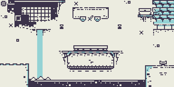
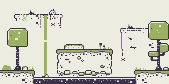
Included is a zip file with the 8px tilesets from the last iteration and their .pyxel source file with the tilemap built in, if anyone would want it.
Not super useful, but they can be pretty:


Files
MageMetalMeat
RPS with a little MEAT on it.
More posts
- On Brand, Off Brand.Apr 13, 2022
- ANNUAL(?!) Check-In: Back to WorkJul 04, 2019
- Game Design and Art directionsJun 18, 2018
- Another 100+ Days ago.Jun 11, 2018
- Back it up.Jan 30, 2018
- Dedication or Obligation?Oct 13, 2017
- Be my Art Director: UnitsSep 27, 2017
- The Secret Hands SocietySep 26, 2017
- Beginnings the Game.Sep 20, 2017
Leave a comment
Log in with itch.io to leave a comment.