Art and Animation Update
Greetings all! I (finally) have some news about an update!
STATUS:
I left my advertising job, and for the last few months have been getting my family routine locked down and making home improvements. In-between I came back to my personal work here on Itch and started sorting. I have been testing how much time I can dedicate to my personal projects. I have enough to start supporting my art, slowly ramping into a good production schedule. I'm still working super-slow, but it is better than completely stalled out.
THE UPDATE:
I had a few things for the art that I always wanted to address, which are done. These changes were made so that I could focus on a physical print version. The original and the new version will both be available.
A: The border. I always felt the border was the weakest part of this deck. It didn't feel cohesive, and I wanted it to feel smart and gamify it a bit. So the new border style hits the marks for me. There were two iterations, one with the text in the number cards, and one without:
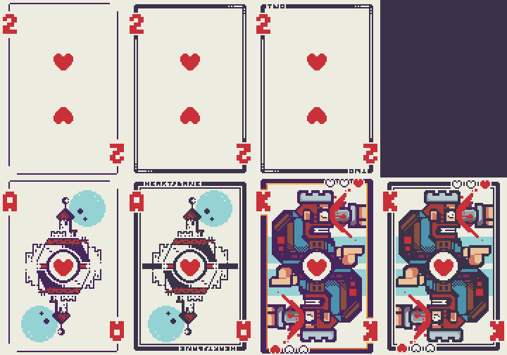
This helps bring all the cards together as a set, which I felt this was lacking. The blue in the Diamond/Heart suites was lighter from the Spade/Club ones. I went with the darker of the two, again to help link the deck together. You can notice the difference in the King and Ace cards above.
B: This change led to an update of the card backs as well:
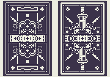
Both work, but the new one on the right reads much more clear for me, and is the back I will be using in the physical print. Also, any opportunity to throw in something that reminds me of the Rood Inverse is an opportunity taken.
C: Narrative: It is a small addition, but HUGE change. The four Kingdoms have names assigned to them on the card, and I'm writing backstory/lore/references for them. This is mostly for me, but I want to have answers and have a fleshed-out world for people that actually find this interesting enough to dive into. This excites me the most about our update.
D: ANIMATIONS!
The most labor-intense part is animating the face cards. The Aces have been completed, and I shared them last week on Twitter:
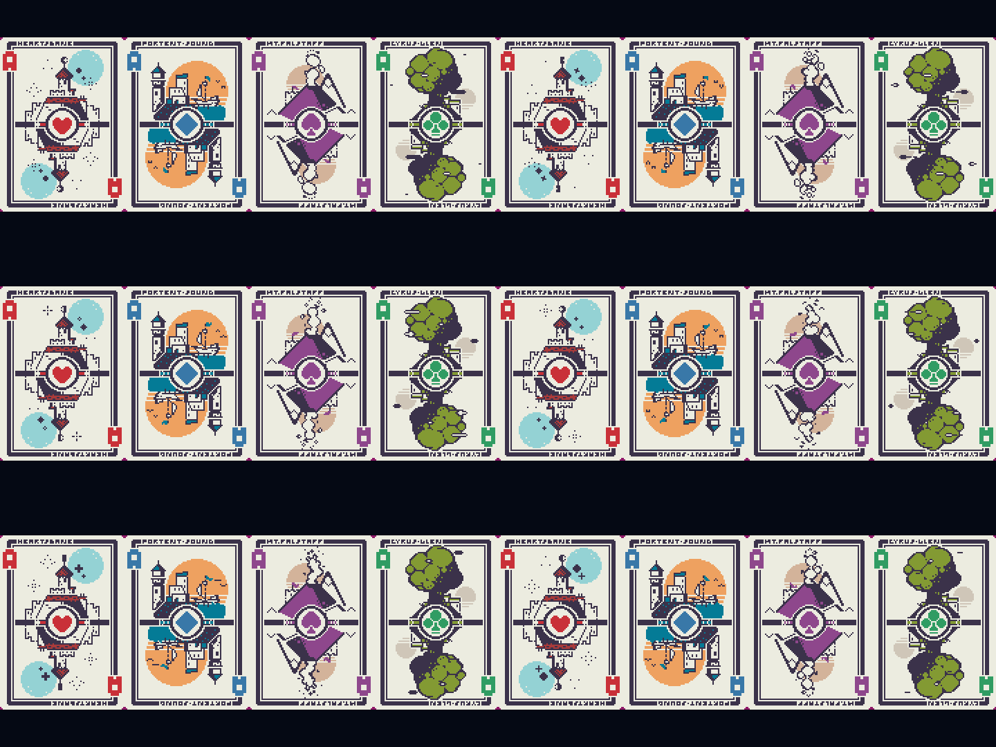
The Face cards will all have separate image sequences (typically 8 frames) and a single row sprite sheet png to go with them.
E: Finally, the cards have a single pixel rounded corner transparency now, as noted in the image above with the burgundy corners. This will help the cards look like actual cards... and not just rectangles.
TIME.LINE:
I refuse to actually set a date with this update; I do not want to commit to - and then let fly by, Douglas Adams style - a deadline. So, I will roll this out in two phases. The first bit is the art, which is complete. This will be uploaded shortly, after I export all the files into a package with a similar setup to the original files. The second update will be all of the animations in a separate zip folder, also with the 1x and 4x sizes.
THANK YOU!
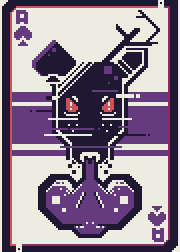
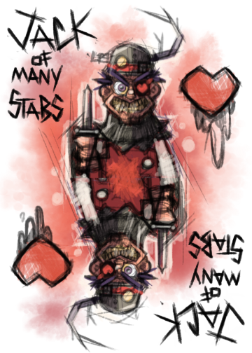
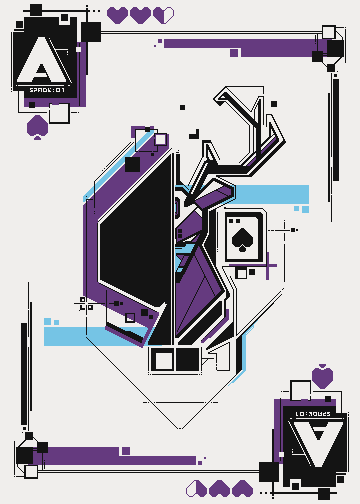
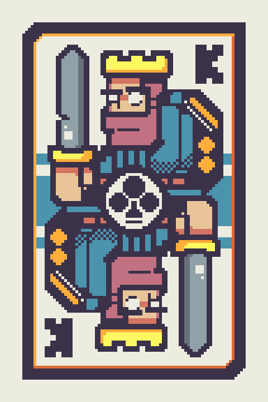
To all of you who have purchased my art and to those who have come here and enjoyed looking at it, thank you! This is by and large my favorite piece of work over the years, and it was spawned from a tiny poster prompt from my former work. Here are the three iterations for the card-art prompt my team gave me that set me off on the idea to make this deck, and the first draft of the king card:
The Deer:
The Heartless Jack: (incorporated this idea/feel into the core of what the heart cards would become.)
The Convoluted Game Story (SolidSpade) Stag:
King. First Draft:
Thank you again
Get Pixel Plebes Digital Card Deck
Pixel Plebes Digital Card Deck
Artistic themed Poker deck for your games.
| Status | Released |
| Category | Assets |
| Author | Greebles |
| Genre | Card Game |
| Tags | animations, Medieval, pixel, Pixel Art, playing-cards, poker |
More posts
- A Bloodless TransfusionJul 23, 2024
- Great Expectations, or "The Lost Pip"Jun 25, 2020
- A FULL DECK: Organizing updateJun 10, 2020
- Racial Equality, RADICAL JUSTICE. BLM Suit added.Jun 08, 2020
- The Animation UPDATE!Jan 30, 2020
- King FixAug 24, 2019

Leave a comment
Log in with itch.io to leave a comment.